A celestial design
Ever wondered how a designer develops and delivers an exhibition? MHNSW's senior graphic designer Bruce Smythe reveals the inspiration behind Celestial City's design concepts and 'supergraphics'.
The art and craft of visual communication
The graphic designer’s role in exhibition design is to give form to the exhibition’s content; primarily through the use of typography (fonts and lettering), image, colour and materials. It is the art and craft of visual communication – stylising and problem-solving in order to most effectively convey the curator’s messages to the visitor. Working closely with the exhibition’s 3D designer, the graphic designer interprets the design brief to help create memorable, compelling and meaningful visitor experiences. The designer’s responsibilities also include project managing the production of the exhibition graphics to ensure they are produced to the highest standard and arrive on time to be installed with the rest of the exhibition.
When it comes to designers, it’s a total team effort. The graphic designer collaborates with others in the Marketing and Communications department to create the exhibition’s branding – the look and feel that will entice visitors to come and see the show. This collaboration between teams ensures consistency between the visitor experience and all marketing communications including print and on-line advertisements and editorial pieces, and museum signage.
Research is essential to effective graphic design for exhibitions.
Celestial Inspiration
The catalyst for the graphic design process for Celestial City: Sydney’s Chinese Story was the title of the exhibition. Thoughts turned to the sky and all things ‘celestial’. Extensive research eventuated in the creation of a repeat pattern based on the ‘auspicious cloud’ motif found in traditional Chinese prints, textiles and carvings. This was applied to the exhibition’s visual identity, theme banners and entrance feature. Another touchstone was the Chinese surcoat from the Powerhouse Museum collection featured in the exhibition’s theme ‘Merchants and Mandarins’. This surcoat informed the overall palette and inspired research into the use of the ‘auspicious cloud’ motif.
Purposely refraining from drawing on communist red and yellow (which denotes China’s more recent history), the exhibition’s palette was derived from Chinese temples – principally the Temple of Heaven in Beijing whose rich blue roof was an inspiration for the theme banners. The greens, violets and coral colours of the text panels were similarly drawn from the temple’s intricate paint scheme.
The typeface for the title treatment was chosen to echo the characters found in traditional Chinese woodblock prints. The typography in the gallery also took cues from vernacular typefaces found on signage from 19th century goldfield shopfronts featured in the exhibition’s theme on ‘Goldminers’.
The use of hanging banners to carry the theme text is a reference to Chinese hanging scrolls – one of the many traditional methods used to display and exhibit Chinese painting and calligraphy.
The Supergraphics
To help create a visually powerful environment, the team decided to include a selection of 'supergraphics’ – monumental reproductions up to 3 metres in height and many metres wide. As the majority of the graphic content was reproduced from black and white original material, bold saturated colours were chosen to colourise these massive images in order to activate the space. These supergraphics were often not confined to one surface, but were bent around corners, and split across structures to create a completely immersive visitor experience.
In order to create these supergraphics we required high resolution digital copies taken from the original material. Some of these were over 10,000 pixels on their longest edge. This allowed for the best possible detail and clarity for each image. To prepare the file I would retouch the digital image as required and resize to fit individual measurements for each supergraphic. To produce these at a sufficient size and print directly on to painted boards, we outsourced the production process to a supplier.
Every exhibition is a new and exciting challenge for graphic designers. They have to present history in inspirational and imaginative ways to provide visitors with a memorable experience and leave a lasting impression.
Published on

Bruce Smythe
Senior Project Designer, Digital and Design
Bruce Smythe is a graphic designer who has specialised in design for cultural institutions for over 20 years, working on museum, exhibition and environmental graphics, branding, and publications for Museums of History NSW, The Australian National Maritime Museum, The State Library of NSW, Powerhouse Museum and The Queen Victoria Museum & Art Gallery
Related
![[First Government House, Sydney] / watercolour drawing by John Eyre](https://images.slm.com.au/fotoweb/embed/2022/11/8b76679c68c649dbb0ab45cfb954e5fb.jpg)
Museum stories
First encounters
The Museum of Sydney is built on and around a site that links us to the very beginnings of modern Australia
Discover Paradise on Earth
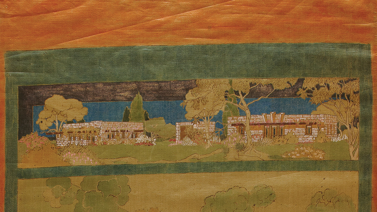
Whether you’re a lover of design, architecture and art, or simply seeking an oasis in the CBD, this new exhibition invites you to reflect on the extraordinary story of architect Marion Mahony Griffin
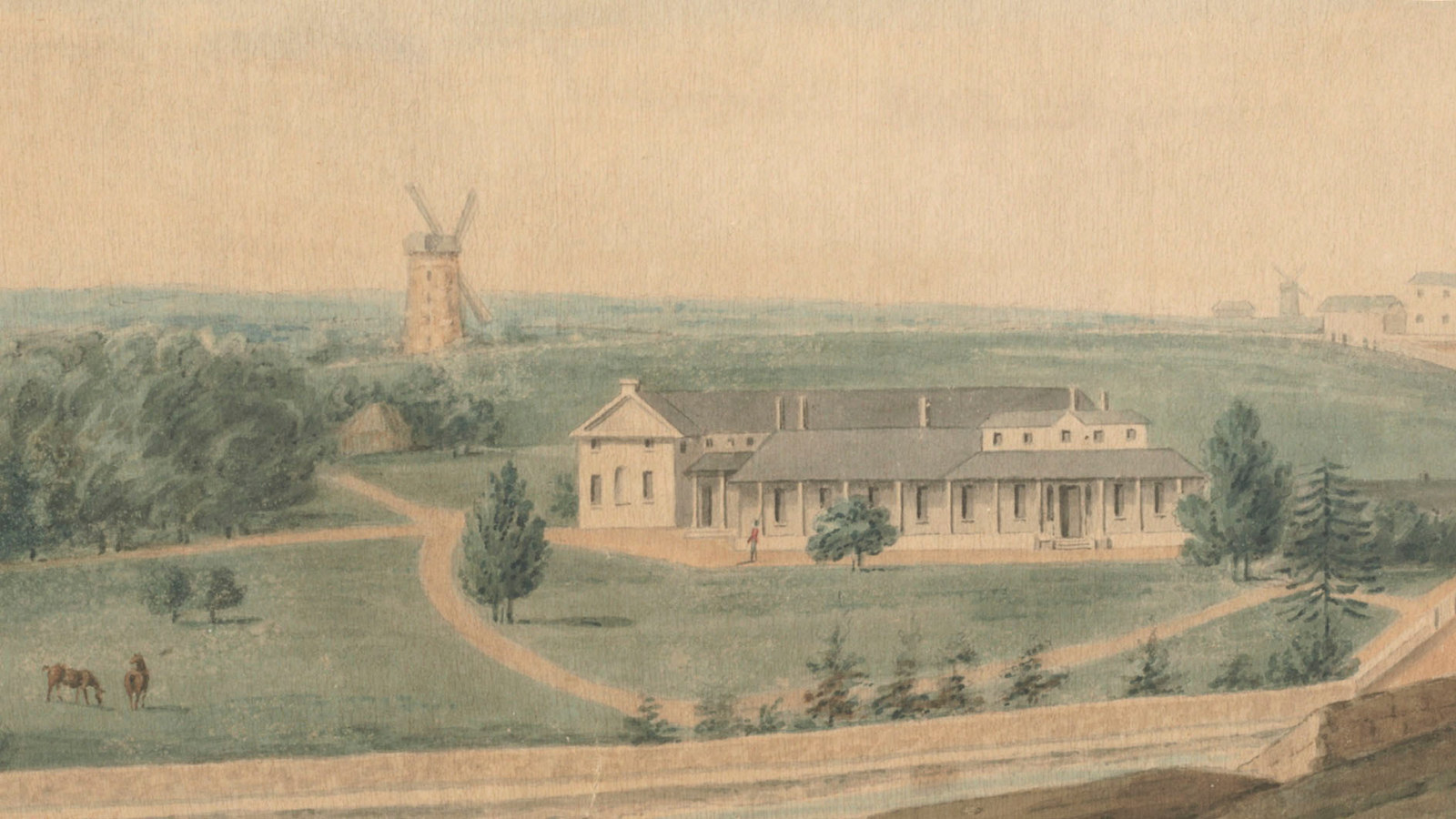
Life at Government House in the Macquarie era
Historian Jane Kelso describes a busy schedule of social gatherings and official events at Sydney's Government House during the governorship of Lachlan Macquarie
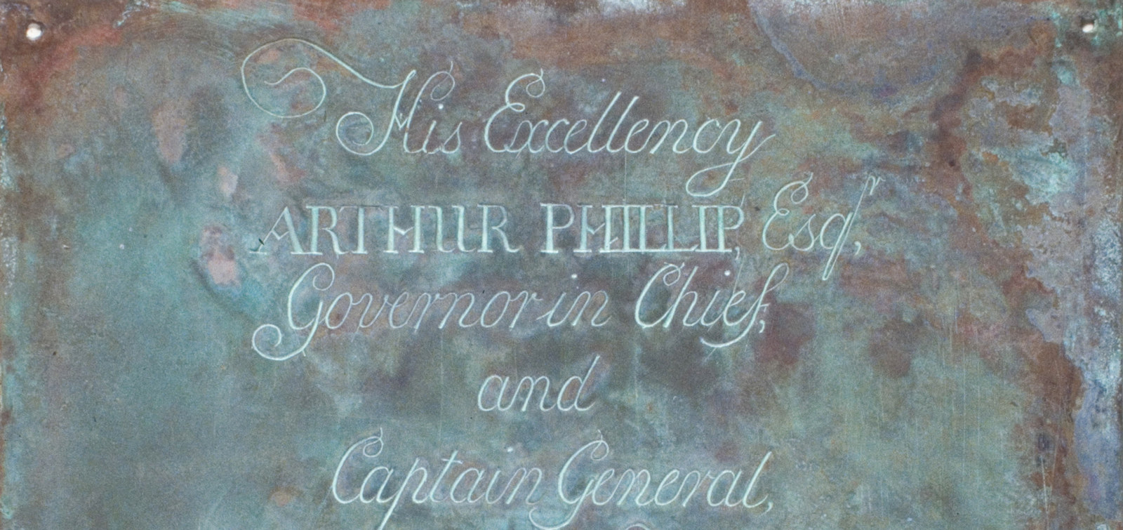
First Government House foundation plate
When the foundation plate was rediscovered in 1899 the site of first Government House was a distant memory